What You Should Know About CSS to Make Your Content More Beautiful
It might be intimidating to decide to "go mobile," or to optimize business content for your workers' smartphones and tablets. To move material into a mobile screen, you or a member of your team is suddenly required to be an HTML and CSS expert. Fortunately, that is not the case. You may easily structure your content for mobile devices using a WYSIWYG platform that enables users to write directly in HTML and a few lines of code.
What about design, though? As we all know, your content's appearance may significantly affect how successful it is. The good news is that you can apply a few straightforward design concepts to make your material accessible and interesting for your team without having to be a professional designer (or pay one!). You can establish consistency, provide value, and create a beautiful project by using simple CSS styling!
In this article, we provide a succinct introduction to several essential design ideas that will enable you to make your material stand out.
COLOR
The simplest method to produce material that upholds your brand and draws attention to particular locations is via the use of color. Simply adding two to three primary colors will work for the bulk of your content initiatives. To achieve some uniformity, use one color for the major paragraph text and list items (often black or grey) and sparingly apply your selected colors to headers (as text color or background color).
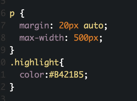
To accomplish this with CSS:
- Use span tags ( >) to emphasize a specific area of a block level element by applying inline color changes.
- Using the link selector in the CSS, assign a project-wide color to each and every hyperlink.

SPACE
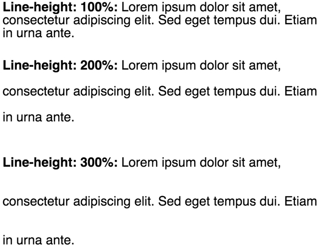
Allowing for white space might be difficult when building responsive digital content. However, line height, margins, and padding are important factors to make your material balanced and understandable. The user experience is enhanced, readability is increased, and a high-quality product is communicated through the effective use of white space.

Below, I’ve listed some code examples to help you format your CSS :
- Line height: http://css-tricks.com/almanac/properties/l/line-height/
- Margins: http://css-tricks.com/almanac/properties/m/margin/
- Padding:http://css-tricks.com/almanac/properties/p/padding/
GRAPHIC HIERARCHY
The visual hierarchy of your material must be maintained by keeping consistency across related pieces. For instance, NYTimes.com uses a restricted combination of serif and sans-serif typefaces and subdued colors to draw readers' attention to the author, the time-stamp, or links to comments while also establishing a visual hierarchy. Always consider what you want your viewers to see first and what is most crucial while developing your content.

From NYTimes.com, a visual hierarchy illustration
To accomplish this with CSS:
- Utilize a backdrop color or border to draw attention to specific parts or call-outs.
- Start a new header section or block quotation with a border.
THE CONCLUSION
Using CSS allows you to apply designs to your entire project at once rather from having to individually tweak each element, which is one of its key advantages. Even if you might not feel confident writing CSS right now, even a tiny bit of expertise will cover your complete project.
Additionally, search for resources and businesses that can assist you. For instance, if you use our platform, you may work with our Enablement Team to develop custom.css files that compile all of your design specifications into a single location that is easily accessible from your writing environment. Because we care as much about getting your content onto the correct devices as we do about its visual appeal.
 English
 Español
 Français
